Extra Trees is an ensemble machine learning algorithm that combines the predictions from many decision trees.
It is related to the widely used random forest algorithm. It can often achieve as-good or better performance than the random forest algorithm, although it uses a simpler algorithm to construct the decision trees used as members of the ensemble.
It is also easy to use given that it has few key hyperparameters and sensible heuristics for configuring these hyperparameters.
In this tutorial, you will discover how to develop Extra Trees ensembles for classification and regression.
After completing this tutorial, you will know:
- Extra Trees ensemble is an ensemble of decision trees and is related to bagging and random forest.
- How to use the Extra Trees ensemble for classification and regression with scikit-learn.
- How to explore the effect of Extra Trees model hyperparameters on model performance.
Let’s get started.

How to Develop an Extra Trees Ensemble with Python
Photo by Nicolas Raymond, some rights reserved.
Tutorial Overview
This tutorial is divided into three parts; they are:
- Extra Trees Algorithm
- Extra Trees Scikit-Learn API
- Extra Trees for Classification
- Extra Trees for Regression
- Extra Trees Hyperparameters
- Explore Number of Trees
- Explore Number of Features
- Explore Minimum Samples per Split
Extra Trees Algorithm
Extremely Randomized Trees, or Extra Trees for short, is an ensemble machine learning algorithm.
Specifically, it is an ensemble of decision trees and is related to other ensembles of decision trees algorithms such as bootstrap aggregation (bagging) and random forest.
The Extra Trees algorithm works by creating a large number of unpruned decision trees from the training dataset. Predictions are made by averaging the prediction of the decision trees in the case of regression or using majority voting in the case of classification.
- Regression: Predictions made by averaging predictions from decision trees.
- Classification: Predictions made by majority voting from decision trees.
The predictions of the trees are aggregated to yield the final prediction, by majority vote in classification problems and arithmetic average in regression problems.
— Extremely Randomized Trees, 2006.
Unlike bagging and random forest that develop each decision tree from a bootstrap sample of the training dataset, the Extra Trees algorithm fits each decision tree on the whole training dataset.
Like random forest, the Extra Trees algorithm will randomly sample the features at each split point of a decision tree. Unlike random forest, which uses a greedy algorithm to select an optimal split point, the Extra Trees algorithm selects a split point at random.
The Extra-Trees algorithm builds an ensemble of unpruned decision or regression trees according to the classical top-down procedure. Its two main differences with other tree-based ensemble methods are that it splits nodes by choosing cut-points fully at random and that it uses the whole learning sample (rather than a bootstrap replica) to grow the trees.
— Extremely Randomized Trees, 2006.
As such, there are three main hyperparameters to tune in the algorithm; they are the number of decision trees in the ensemble, the number of input features to randomly select and consider for each split point, and the minimum number of samples required in a node to create a new split point.
It has two parameters: K, the number of attributes randomly selected at each node and nmin, the minimum sample size for splitting a node. […] we denote by M the number of trees of this ensemble.
— Extremely Randomized Trees, 2006.
The random selection of split points makes the decision trees in the ensemble less correlated, although this increases the variance of the algorithm. This increase in variance can be countered by increasing the number of trees used in the ensemble.
The parameters K, nmin and M have different effects: K determines the strength of the attribute selection process, nmin the strength of averaging output noise, and M the strength of the variance reduction of the ensemble model aggregation.
— Extremely Randomized Trees, 2006.
Extra Trees Scikit-Learn API
Extra Trees ensembles can be implemented from scratch, although this can be challenging for beginners.
The scikit-learn Python machine learning library provides an implementation of Extra Trees for machine learning.
It is available in a recent version of the library.
First, confirm that you are using a modern version of the library by running the following script:
# check scikit-learn version
import sklearn
print(sklearn.__version__)
Running the script will print your version of scikit-learn.
Your version should be the same or higher.
If not, you must upgrade your version of the scikit-learn library.
0.22.1
Extra Trees is provided via the ExtraTreesRegressor and ExtraTreesClassifier classes.
Both models operate the same way and take the same arguments that influence how the decision trees are created.
Randomness is used in the construction of the model. This means that each time the algorithm is run on the same data, it will produce a slightly different model.
When using machine learning algorithms that have a stochastic learning algorithm, it is good practice to evaluate them by averaging their performance across multiple runs or repeats of cross-validation. When fitting a final model, it may be desirable to either increase the number of trees until the variance of the model is reduced across repeated evaluations, or to fit multiple final models and average their predictions.
Let’s take a look at how to develop an Extra Trees ensemble for both classification and regression.
Extra Trees for Classification
In this section, we will look at using Extra Trees for a classification problem.
First, we can use the make_classification() function to create a synthetic binary classification problem with 1,000 examples and 20 input features.
The complete example is listed below.
# test classification dataset
from sklearn.datasets import make_classification
# define dataset
X, y = make_classification(n_samples=1000, n_features=20, n_informative=15, n_redundant=5, random_state=4)
# summarize the dataset
print(X.shape, y.shape)
Running the example creates the dataset and summarizes the shape of the input and output components.
(1000, 20) (1000,)
Next, we can evaluate an Extra Trees algorithm on this dataset.
We will evaluate the model using repeated stratified k-fold cross-validation, with three repeats and 10 folds. We will report the mean and standard deviation of the accuracy of the model across all repeats and folds.
# evaluate extra trees algorithm for classification
from numpy import mean
from numpy import std
from sklearn.datasets import make_classification
from sklearn.model_selection import cross_val_score
from sklearn.model_selection import RepeatedStratifiedKFold
from sklearn.ensemble import ExtraTreesClassifier
# define dataset
X, y = make_classification(n_samples=1000, n_features=20, n_informative=15, n_redundant=5, random_state=4)
# define the model
model = ExtraTreesClassifier()
# evaluate the model
cv = RepeatedStratifiedKFold(n_splits=10, n_repeats=3, random_state=1)
n_scores = cross_val_score(model, X, y, scoring='accuracy', cv=cv, n_jobs=-1, error_score='raise')
# report performance
print('Accuracy: %.3f (%.3f)' % (mean(n_scores), std(n_scores)))
Running the example reports the mean and standard deviation accuracy of the model.
Your specific results may vary given the stochastic nature of the learning algorithm. Try running the example a few times.
In this case, we can see the Extra Trees ensemble with default hyperparameters achieves a classification accuracy of about 91 percent on this test dataset.
Accuracy: 0.910 (0.027)
We can also use the Extra Trees model as a final model and make predictions for classification.
First, the Extra Trees ensemble is fit on all available data, then the predict() function can be called to make predictions on new data.
The example below demonstrates this on our binary classification dataset.
# make predictions using extra trees for classification
from sklearn.datasets import make_classification
from sklearn.ensemble import ExtraTreesClassifier
# define dataset
X, y = make_classification(n_samples=1000, n_features=20, n_informative=15, n_redundant=5, random_state=4)
# define the model
model = ExtraTreesClassifier()
# fit the model on the whole dataset
model.fit(X, y)
# make a single prediction
row = [[-3.52169364,4.00560592,2.94756812,-0.09755101,-0.98835896,1.81021933,-0.32657994,1.08451928,4.98150546,-2.53855736,3.43500614,1.64660497,-4.1557091,-1.55301045,-0.30690987,-1.47665577,6.818756,0.5132918,4.3598337,-4.31785495]]
yhat = model.predict(row)
print('Predicted Class: %d' % yhat[0])
Running the example fits the Extra Trees ensemble model on the entire dataset and is then used to make a prediction on a new row of data, as we might when using the model in an application.
Predicted Class: 0
Now that we are familiar with using Extra Trees for classification, let’s look at the API for regression.
Extra Trees for Regression
In this section, we will look at using Extra Trees for a regression problem.
First, we can use the make_regression() function to create a synthetic regression problem with 1,000 examples and 20 input features.
The complete example is listed below.
# test regression dataset
from sklearn.datasets import make_regression
# define dataset
X, y = make_regression(n_samples=1000, n_features=20, n_informative=15, noise=0.1, random_state=3)
# summarize the dataset
print(X.shape, y.shape)
Running the example creates the dataset and summarizes the shape of the input and output components.
(1000, 20) (1000,)
Next, we can evaluate an Extra Trees algorithm on this dataset.
As we did with the last section, we will evaluate the model using repeated k-fold cross-validation, with three repeats and 10 folds. We will report the mean absolute error (MAE) of the model across all repeats and folds.
The scikit-learn library makes the MAE negative so that it is maximized instead of minimized. This means that larger negative MAE are better and a perfect model has a MAE of 0.
The complete example is listed below.
# evaluate extra trees ensemble for regression
from numpy import mean
from numpy import std
from sklearn.datasets import make_regression
from sklearn.model_selection import cross_val_score
from sklearn.model_selection import RepeatedKFold
from sklearn.ensemble import ExtraTreesRegressor
# define dataset
X, y = make_regression(n_samples=1000, n_features=20, n_informative=15, noise=0.1, random_state=3)
# define the model
model = ExtraTreesRegressor()
# evaluate the model
cv = RepeatedKFold(n_splits=10, n_repeats=3, random_state=1)
n_scores = cross_val_score(model, X, y, scoring='neg_mean_absolute_error', cv=cv, n_jobs=-1, error_score='raise')
# report performance
print('MAE: %.3f (%.3f)' % (mean(n_scores), std(n_scores)))
Running the example reports the mean and standard deviation accuracy of the model.
Your specific results may vary given the stochastic nature of the learning algorithm. Try running the example a few times.
In this case, we can see the Extra Trees ensemble with default hyperparameters achieves a MAE of about 70.
MAE: -69.561 (5.616)
We can also use the Extra Trees model as a final model and make predictions for regression.
First, the Extra Trees ensemble is fit on all available data, then the predict() function can be called to make predictions on new data.
The example below demonstrates this on our regression dataset.
# extra trees for making predictions for regression
from sklearn.datasets import make_regression
from sklearn.ensemble import ExtraTreesRegressor
# define dataset
X, y = make_regression(n_samples=1000, n_features=20, n_informative=15, noise=0.1, random_state=3)
# define the model
model = ExtraTreesRegressor()
# fit the model on the whole dataset
model.fit(X, y)
# make a single prediction
row = [[-0.56996683,0.80144889,2.77523539,1.32554027,-1.44494378,-0.80834175,-0.84142896,0.57710245,0.96235932,-0.66303907,-1.13994112,0.49887995,1.40752035,-0.2995842,-0.05708706,-2.08701456,1.17768469,0.13474234,0.09518152,-0.07603207]]
yhat = model.predict(row)
print('Prediction: %d' % yhat[0])
Running the example fits the Extra Trees ensemble model on the entire dataset and is then used to make a prediction on a new row of data, as we might when using the model in an application.
Prediction: 53
Now that we are familiar with using the scikit-learn API to evaluate and use Extra Trees ensembles, let’s look at configuring the model.
Extra Trees Hyperparameters
In this section, we will take a closer look at some of the hyperparameters you should consider tuning for the Extra Trees ensemble and their effect on model performance.
Explore Number of Trees
An important hyperparameter for Extra Trees algorithm is the number of decision trees used in the ensemble.
Typically, the number of trees is increased until the model performance stabilizes. Intuition might suggest that more trees will lead to overfitting, although this is not the case. Bagging, Random Forest, and Extra Trees algorithms appear to be somewhat immune to overfitting the training dataset given the stochastic nature of the learning algorithm.
The number of trees can be set via the “n_estimators” argument and defaults to 100.
The example below explores the effect of the number of trees with values between 10 to 5,000.
# explore extra trees number of trees effect on performance
from numpy import mean
from numpy import std
from sklearn.datasets import make_classification
from sklearn.model_selection import cross_val_score
from sklearn.model_selection import RepeatedStratifiedKFold
from sklearn.ensemble import ExtraTreesClassifier
from matplotlib import pyplot
# get the dataset
def get_dataset():
X, y = make_classification(n_samples=1000, n_features=20, n_informative=15, n_redundant=5, random_state=4)
return X, y
# get a list of models to evaluate
def get_models():
models = dict()
models['10'] = ExtraTreesClassifier(n_estimators=10)
models['50'] = ExtraTreesClassifier(n_estimators=50)
models['100'] = ExtraTreesClassifier(n_estimators=100)
models['500'] = ExtraTreesClassifier(n_estimators=500)
models['1000'] = ExtraTreesClassifier(n_estimators=1000)
models['5000'] = ExtraTreesClassifier(n_estimators=5000)
return models
# evaluate a given model using cross-validation
def evaluate_model(model):
cv = RepeatedStratifiedKFold(n_splits=10, n_repeats=3, random_state=1)
scores = cross_val_score(model, X, y, scoring='accuracy', cv=cv, n_jobs=-1, error_score='raise')
return scores
# define dataset
X, y = get_dataset()
# get the models to evaluate
models = get_models()
# evaluate the models and store results
results, names = list(), list()
for name, model in models.items():
scores = evaluate_model(model)
results.append(scores)
names.append(name)
print('>%s %.3f (%.3f)' % (name, mean(scores), std(scores)))
# plot model performance for comparison
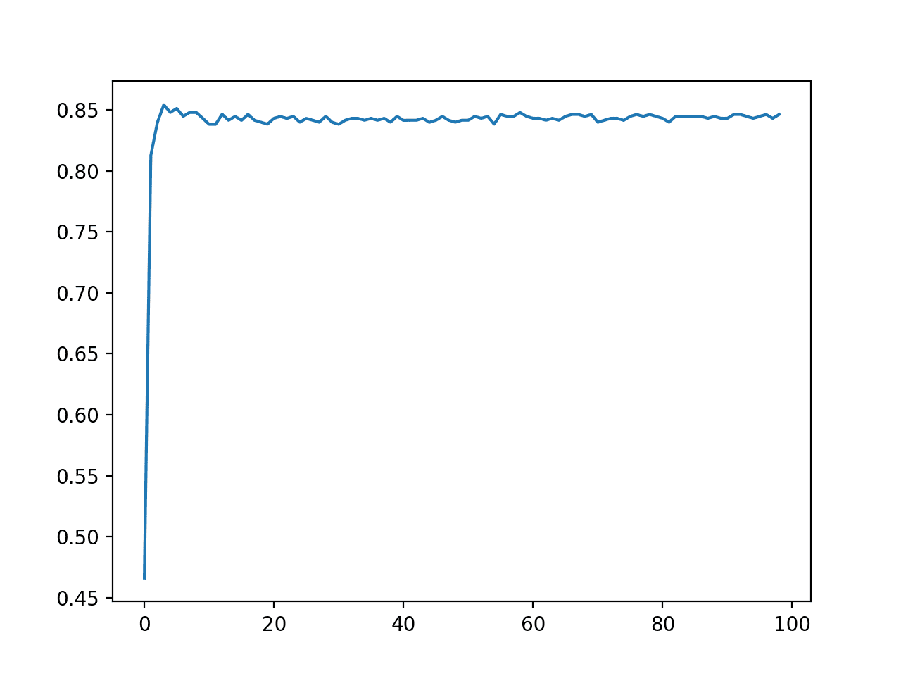
pyplot.boxplot(results, labels=names, showmeans=True)
pyplot.show()Running the example first reports the mean accuracy for each configured number of decision trees.
In this case, we can see that performance rises and stays flat after about 100 trees. Mean accuracy scores fluctuate across 100, 500, and 1,000 trees and this may be statistical noise.
>10 0.860 (0.029)
>50 0.904 (0.027)
>100 0.908 (0.026)
>500 0.910 (0.027)
>1000 0.910 (0.026)
>5000 0.912 (0.026)
A box and whisker plot is created for the distribution of accuracy scores for each configured number of trees.
We can see the general trend of increasing performance with the number of trees, perhaps leveling out after 100 trees.
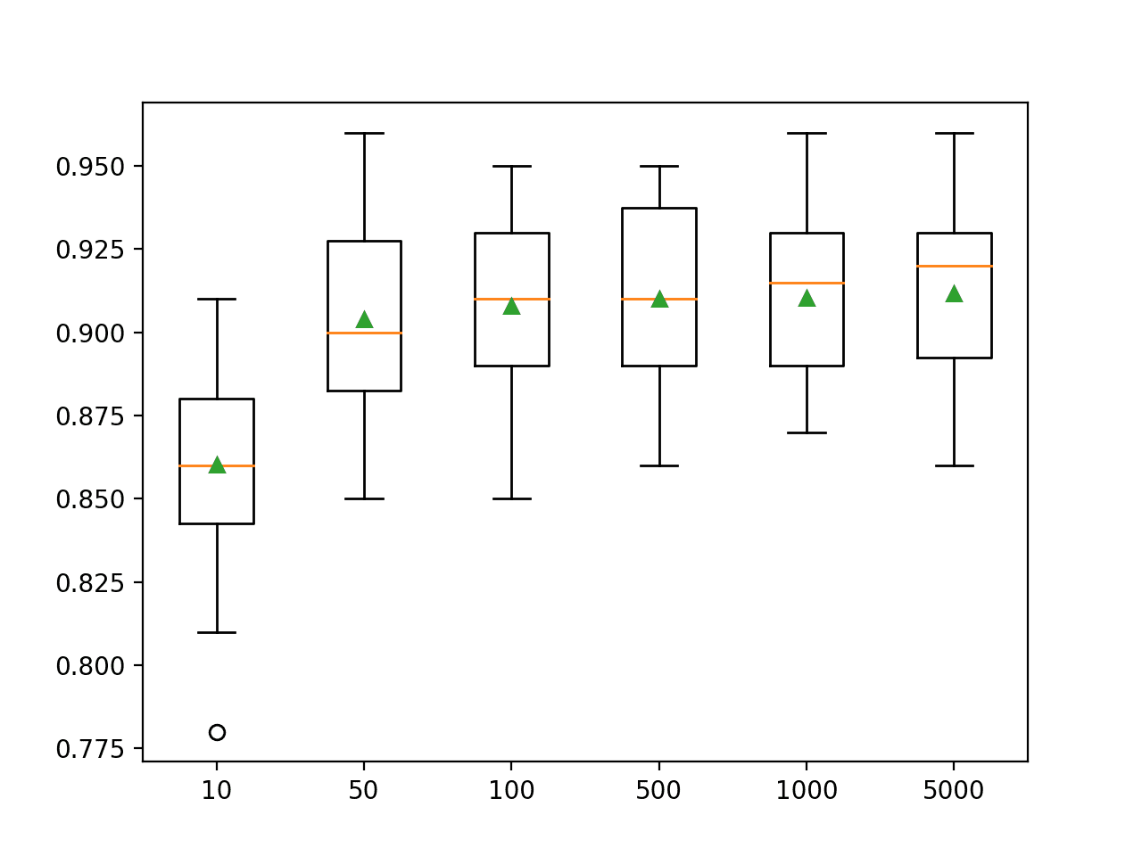
Box Plot of Extra Trees Ensemble Size vs. Classification Accuracy
Explore Number of Features
The number of features that is randomly sampled for each split point is perhaps the most important feature to configure for Extra Trees, as it is for Random Forest.
Like Random Forest, the Extra Trees algorithm is not sensitive to the specific value used, although it is an important hyperparameter to tune.
It is set via the max_features argument and defaults to the square root of the number of input features. In this case for our test dataset, this would be sqrt(20) or about four features.
The example below explores the effect of the number of features randomly selected at each split point on model accuracy. We will try values from 1 to 20 and would expect a small value around four to perform well based on the heuristic.
# explore extra trees number of features effect on performance
from numpy import mean
from numpy import std
from sklearn.datasets import make_classification
from sklearn.model_selection import cross_val_score
from sklearn.model_selection import RepeatedStratifiedKFold
from sklearn.ensemble import ExtraTreesClassifier
from matplotlib import pyplot

# get the dataset
def get_dataset():
	X, y = make_classification(n_samples=1000, n_features=20, n_informative=15, n_redundant=5, random_state=4)
	return X, y

# get a list of models to evaluate
def get_models():
	models = dict()
	for i in range(1, 21):
		models[str(i)] = ExtraTreesClassifier(max_features=i)
	return models

# evaluate a given model using cross-validation
def evaluate_model(model):
	cv = RepeatedStratifiedKFold(n_splits=10, n_repeats=3, random_state=1)
	scores = cross_val_score(model, X, y, scoring='accuracy', cv=cv, n_jobs=-1, error_score='raise')
	return scores

# define dataset
X, y = get_dataset()
# get the models to evaluate
models = get_models()
# evaluate the models and store results
results, names = list(), list()
for name, model in models.items():
	scores = evaluate_model(model)
	results.append(scores)
	names.append(name)
	print('>%s %.3f (%.3f)' % (name, mean(scores), std(scores)))
# plot model performance for comparison
pyplot.boxplot(results, labels=names, showmeans=True)
pyplot.show()
Running the example first reports the mean accuracy for each feature set size.
In this case, the results suggest that a value between four and nine would be appropriate, confirming the sensible default of four on this dataset.
A value of nine might even be better given the larger mean and smaller standard deviation in classification accuracy, although the differences in scores may or may not be statistically significant.
>1 0.901 (0.028)
>2 0.909 (0.028)
>3 0.901 (0.026)
>4 0.909 (0.030)
>5 0.909 (0.028)
>6 0.910 (0.025)
>7 0.908 (0.030)
>8 0.907 (0.025)
>9 0.912 (0.024)
>10 0.904 (0.029)
>11 0.904 (0.025)
>12 0.908 (0.026)
>13 0.908 (0.026)
>14 0.906 (0.030)
>15 0.909 (0.024)
>16 0.908 (0.023)
>17 0.910 (0.021)
>18 0.909 (0.023)
>19 0.907 (0.025)
>20 0.903 (0.025)
A box and whisker plot is created for the distribution of accuracy scores for each feature set size.
We see a trend in performance rising and peaking with values between four and nine and falling or staying flat as larger feature set sizes are considered.

Box Plot of Extra Trees Feature Set Size vs. Classification Accuracy
Explore Minimum Samples per Split
A final interesting hyperparameter is the number of samples in a node of the decision tree before adding a split.
New splits are only added to a decision tree if the number of samples is equal to or exceeds this value. It is set via the “min_samples_split” argument and defaults to two samples (the lowest value). Smaller numbers of samples result in more splits and a deeper, more specialized tree. In turn, this can mean lower correlation between the predictions made by trees in the ensemble and potentially lift performance.
The example below explores the effect of Extra Trees minimum samples before splitting on model performance, test values between two and 14.
# explore extra trees minimum number of samples for a split effect on performance
from numpy import mean
from numpy import std
from sklearn.datasets import make_classification
from sklearn.model_selection import cross_val_score
from sklearn.model_selection import RepeatedStratifiedKFold
from sklearn.ensemble import ExtraTreesClassifier
from matplotlib import pyplot

# get the dataset
def get_dataset():
	X, y = make_classification(n_samples=1000, n_features=20, n_informative=15, n_redundant=5, random_state=4)
	return X, y

# get a list of models to evaluate
def get_models():
	models = dict()
	for i in range(2, 15):
		models[str(i)] = ExtraTreesClassifier(min_samples_split=i)
	return models

# evaluate a given model using cross-validation
def evaluate_model(model):
	cv = RepeatedStratifiedKFold(n_splits=10, n_repeats=3, random_state=1)
	scores = cross_val_score(model, X, y, scoring='accuracy', cv=cv, n_jobs=-1, error_score='raise')
	return scores

# define dataset
X, y = get_dataset()
# get the models to evaluate
models = get_models()
# evaluate the models and store results
results, names = list(), list()
for name, model in models.items():
	scores = evaluate_model(model)
	results.append(scores)
	names.append(name)
	print('>%s %.3f (%.3f)' % (name, mean(scores), std(scores)))
# plot model performance for comparison
pyplot.boxplot(results, labels=names, showmeans=True)
pyplot.show()
Running the example first reports the mean accuracy for each configured maximum tree depth.
In this case, we can see that small values result in better performance, confirming the sensible default of two.
>2 0.909 (0.025)
>3 0.907 (0.026)
>4 0.907 (0.026)
>5 0.902 (0.028)
>6 0.902 (0.027)
>7 0.904 (0.024)
>8 0.899 (0.026)
>9 0.896 (0.029)
>10 0.896 (0.027)
>11 0.897 (0.028)
>12 0.894 (0.026)
>13 0.890 (0.026)
>14 0.892 (0.027)
A box and whisker plot is created for the distribution of accuracy scores for each configured maximum tree depth.
In this case, we can see a trend of improved performance with fewer minimum samples for a split, as we might expect.
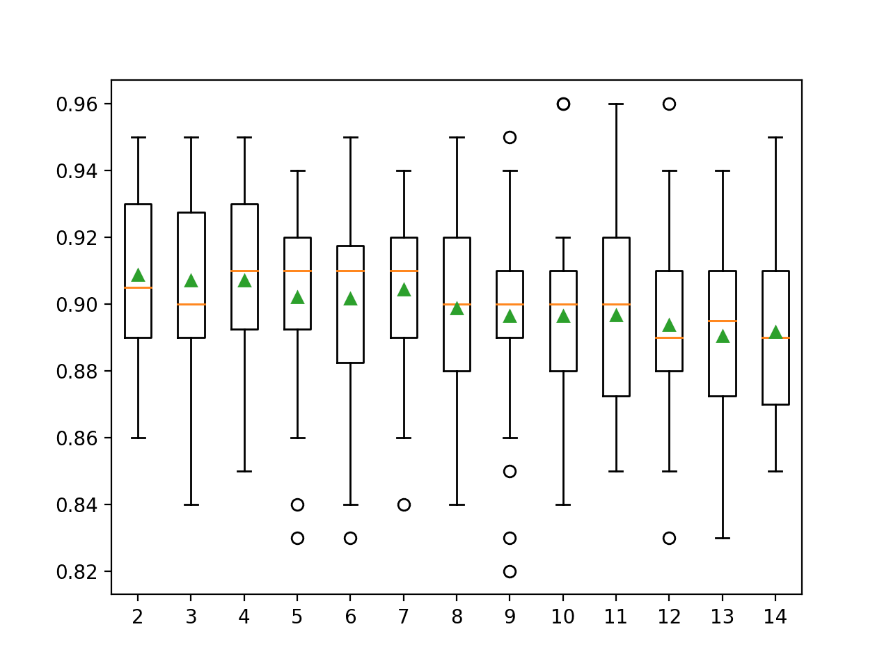
Box Plot of Extra Trees Minimum Samples per Split vs. Classification Accuracy
Further Reading
This section provides more resources on the topic if you are looking to go deeper.
Papers
- Extremely Randomized Trees, 2006.
APIs
Summary
In this tutorial, you discovered how to develop Extra Trees ensembles for classification and regression.
Specifically, you learned:
- Extra Trees ensemble is an ensemble of decision trees and is related to bagging and random forest.
- How to use the Extra Trees ensemble for classification and regression with scikit-learn.
- How to explore the effect of Extra Trees model hyperparameters on model performance.
Do you have any questions?
Ask your questions in the comments below and I will do my best to answer.
The post How to Develop an Extra Trees Ensemble with Python appeared first on Machine Learning Mastery.